For my first post, I want to talk about a subject near and dear to my heart, jerseys. More specifically, I want to talk about the new logo and uniforms of the Tampa Bay Lightning of the National Hockey League. The Lightning released the new look on Monday (Jan. 31) and will begin using it immediately following the 2010-11 NHL season.
I am going to break this down into several different sub-categories and from there say whether the new design is an upgrade, downgrade, or a push (no change). The categories I am going to use are the jerseys themselves (without team logos), the complete uniform, the primary and secondary team logos, and the team colors.
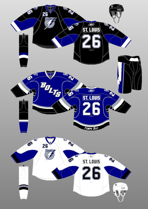
The first aspect of the new look Lightning that I would like to look at are the primary team logos. This is what the Lightning currently look like, this is what they will look like in the future, and this is my first impression of the new look. Based on first impression, I'm really not a fan of the new look. It appears to be just an extremely simplified version of the current logo. In my opinion, the circle around the lightning bolt really serves no purpose at all. Even though I believe that it's probably there for symmetry reasons. I personally would have rather seen a stylized lightning bolt stand alone by itself. I would have also liked to see a little more color in the logo itself. In many cases, I believe that simple is better, this is not one of those cases. Primary logo - Downgrade
The next aspect that I want to move on to are the new alternate logos for the Lightning. Before moving forward though, I have some recommended reading. Back in November, the folks at Puck Drawn created a "guide" outlining how to design the next alternate NHL jersey. When I first saw the Lightning's new alternate logo, that article was the first thing that came to mind. That logo is replacing this one, which the Lightning have used (with a few updates) since joining the NHL for the 1992-93 season. I have always been a fan of the current alternate logo and really hate to see it go. The new alternate logo really seems like a cookie cutter design to me with little or no thought or creativity put into it. I would much rather see the Lightning update the current alternate logo with the new color scheme. Alternate logo - Downgrade
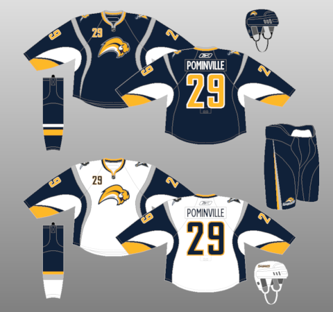
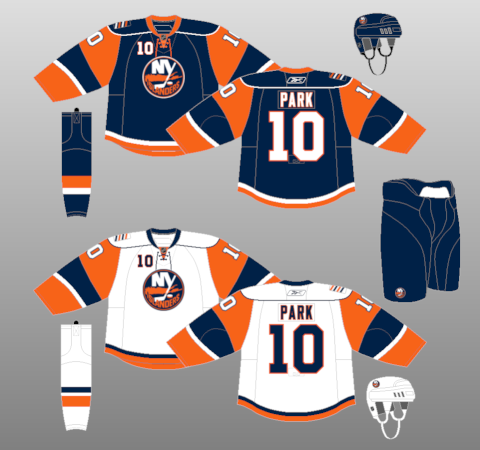
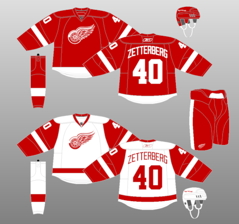
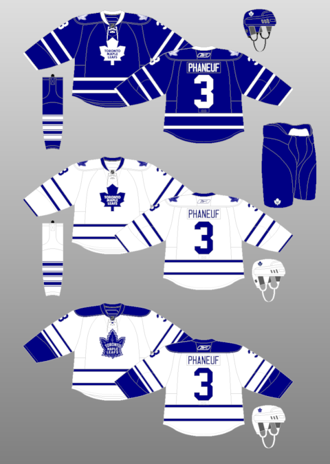
The next aspect I would like to look at are the jerseys themselves. Keep in mind that while looking at the jerseys, I am just looking at the jersey without the team logos (even though the pictures used as references will include logos). This is what the Lightning are currently wearing at home, and this is what they will be wearing next season. In contrast, this is what the Lightning wear away from the St. Pete Times Forum, and this is what they will be wearing. The first thing that I notice about the new set is that it is a lot more traditional in its striping, which I like to see. The Reebok Edge movement has created some extremely flashy, if not gaudy, NHL jerseys so it is nice to see teams go with a more traditional look. On a side note, the Sabres design was created one season before the Reebok Edge jerseys were introduced, but the one shown is the Reebok Edge version of that design. The next thing that really caught my eye was the similarity of it to a couple of other NHL teams. This jersey really looks like offspring of a Detroit Red Wings and Toronto Maple Leafs jersey. One other aspect that really jumped out at me was the new lace up neck. This is one thing I absolutely love about hockey jerseys. A lace up neck just screams classic to me, which I really like. Jersey design - Upgrade
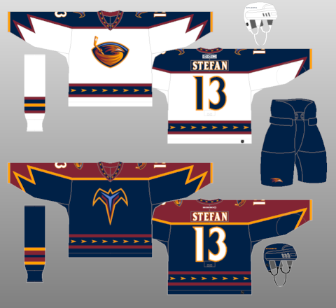
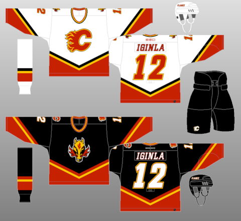
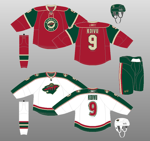
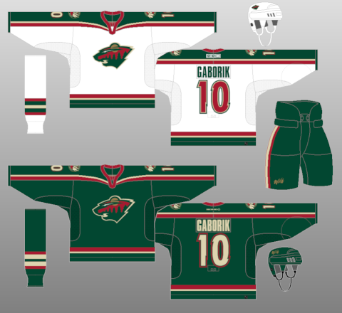
The next thing that I'd like to do is bring all of the individual elements back together and look at the entire uniform as a whole. For the last time, for comparison sake, we need to look at the present and future (home, away) of the Tampa Bay Lightning. The first thing that really stands out here are the different crests on the front of the home and away jerseys. Some teams can pull this off, but I don't think the Lightning succeeded in this regard. I liked it when the Thrashers did it early in their history. It looked good when the Flames did it in the early 2000s. The Minnesota Wild are currently doing it, and it looks nice, but I still like this combination better. I really don't know why the Lightning think they need to add the region name to the front of their road jerseys, while still using the same crest. It just seems unnecessary to me and doesn't look great in this situation.
The other thing I really liked about the current Lightning uniforms are the lightning bolts down the side of the pants. I typically like things traditional when it comes to NHL jerseys, but I thought the bolts on the pants really worked for the Lightning in this case. On the new set of uniforms, the bolts are gone. Even in the new blue/white color scheme, I think the bolts on the pants would've worked.
The one part of the current uniform set that is apparently being retained are the "Bolts" alternates (even though I'm sure they'll update the shoulder logos to reflect the new look - no official word on that though). I've never really been a fan of these, or any team jersey that features a slang nickname across the front. On a positive note, the Ottawa Senators will apparently no longer be using their "Sens" alternates next season. Uniform as a whole - Downgrade
The last aspect that needs to be looked at are the team colors. Their current colors are black, blue, silver and white which they are simplifying, making it just a blue and white color scheme. Even though I like the current color scheme better, the new one works with what they are trying to accomplish with this new design. Color scheme - Slight upgrade
With the new color scheme and identity the Lightning are going with next season, it is obvious that they are going for a classic look. This is extremely refreshing, considering the current flashy/gaudy trend that the NHL (and NFL) and Reebok are currently in. Even though I love the though, I think the "Bolts" missed the mark a little bit here.
No comments:
Post a Comment