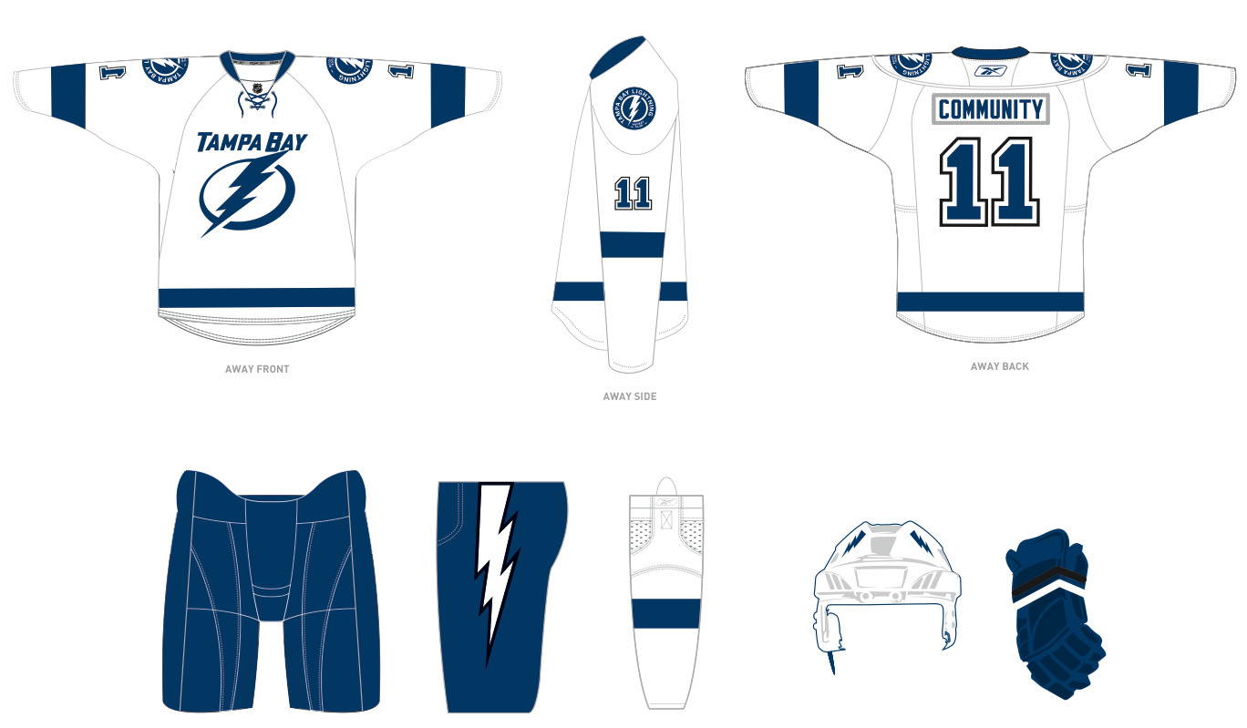
Since the initial unveiling of their new uniforms, the Tampa Bay Lightning have to make a few revisions before the uniforms see the ice next season. They have decided to add black as an accent color around the numbers, as a tribute to the current Lightning color scheme. They have also decided to bring back the lightning bolts on the pants, which is something I was really hoping that they would do in my first post.
With that said, here are the new away uniforms for the Lightning. Here is the updated home version.
As you can see, they really didn't make any changes, other than the two I mentioned earlier. I really would have liked to see them take "Tampa Bay" off of the front of the away jerseys, but I'm not going to go there again.
As I did before, I'm going to go ahead and break down the two changes that the Lightning have made to their jerseys. I'm going to do it slightly different however. Instead of comparing the changes to the current uniform set, as I did before, I'm going to compare these changes to the uniform that was originally unveiled.
Let's first take a look at the new black accent color, which it appears will only be used around the uniform numbers (on both jerseys) and on the new lightning bolt on the pants. I really have mixed emotions on this one.
Before I continue, let me get into a side story on this issue, which will better explain my point. After the original unveiling, the team received immediate feedback on the new uniforms from fans. This is nothing new. It happens every time a change of some kind is made. In this instance however, several fans who contacted the team about the new uniforms were given invitations to meet with members of the front office to discuss their feelings on the new uniforms. If you read the second post here, you will be able to read the details about one of those meetings. The poster claims that she got to meet with CEO Tod Leiweke, General Manager Steve Yzerman and COO Steve Griggs. Not bad company if I do say so myself. Hell, I would've sent in my first blog had I known I could have possibly had the opportunity to meet with Steve Yzerman. Being a Red Wings fan, that would be one of (if not the) coolest experience(s) of my life.
Now, back to the black accents on the new uniforms. I really like that the Lightning were willing to talk to fans to see what they wanted to be included. To me that is going above and beyond the call of duty. Most teams will just send out a generic "thanks for your input, we'll take it under consideration" letter. Even though they probably never took your opinion into consideration at all. Of course, that's just speculation on my part. With that said, this added black still falls into the "epic fail" category. When the original jersey was introduced, it was meant to imitate a classic two color jersey (i.e. Red Wings, Maple Leafs). Now all of a sudden the added black just doesn't fit with the rest of the jersey. On top of that, look at the new lightning bolt on the pants, and then look at the bolt on the front of the jersey. They added the black accent to the bolt on the pants, but not the one on the front of the jersey. Those differing bolts now create an inconsistency that just doesn't look good together. Black Accent Color - Downgrade
Now lets move on to the previously mentioned lightning bolt on the pants. As I said before, in this post and my previous one, that this is something I really wanted added to the uniform. The plain white stripe down the pants is classic, but the bolt works for the lightning. I'm excited that they took "my" advice and added it, but I don't like that they added the black accent to it. Like I said, it now creates an inconsistency with the bolt on the front of the jersey. If you're going to add black to one, you have to add it to the other. I think a white bolt on blue pants would've looked just fine. Plus it would've fit the new two color scheme that the team had previously chosen to go with. Had they just kept the lightning bolt white, this would have been an "off the charts" upgrade in this category. However with the black accents and the inconsistent bolts on the uniform, this is just a slight upgrade. But an upgrade none the less. Bolts Added to Pants: Slight Upgrade
I think those will officially be the final changes the Lightning make to their uniforms for the upcoming season. However if something new comes along, I'll be sure to post it here.
Thursday, February 24, 2011
Wednesday, February 23, 2011
Check It at the Door
Just out of curiousity, what is it that makes professional athletes think that they can pick and choose where they play? It's one thing if you're a free agent and several teams are bidding for your services, it's completely different when you haven't done anything in the league or are still under contract with somebody else.
The first thing I think of right away in this matter is Eli Manning. In the 2004 NFL Draft, the Chargers owned the number one overall pick, which was projected to be Manning prior to the draft. However before the draft, Team Manning said that Eli would not play for the Chargers if they drafted him number one overall in the draft. They wanted to play on the east coast (i.e. New York). So what did the Chargers do? They drafted him number one and later traded him to the Giants. I still love that picture, look at him holding his hands over the lighning bolts on the jersey. So I'm wondering at this point, you have not played a down in the NFL, so what gives you the right to pick and choose where you play? I heard a stat one time, I'm not sure of its accuracy, but it said that less than 1% of all college athletes play their sport at the professional level. If that's true, think how lucky you are just to be playing in the NFL. If you don't want to play for the Chargers, I can think of about 99% of the NCAA football players that would jump at that chance.
Then you have Yi Jianlian of the NBA. He was drafted sixth overall in the 2007 NBA Draft by the Milwaukee Bucks, even though they were warned not to draft him prior to the draft. He didn't want to play in Milwaukee because they didn't have a large enough Asian-American population. Again, you're lucky just to be playing in the NBA, so why does your entry franchise matter? Breaking news, if you play well enough, the Asian-American and Asian-Asian population will take notice, no matter where you are playing. Case and point, Yao Ming. He's only played in 5 games this season, due to injury, yet in fan vote he was voted as the starting center for the western conference in the All-Star Game. Miraculously, he was traded to the New Jersey Nets after one season in Milwaukee. Coincidence, I think not. Prior to the current NBA season, Yi was traded to the Washington Wizards. Playing for three teams in four NBA seasons tells me that Yi is not a good enough NBA player to pick and choose his own address, especially before even playing a game in "the Association."
Then there's "King" LeBron James. Talk about a grade-A piece of.... Is it possible to handle a free agency decision any worse? Prior to the "LeBron James: Celebration of Me" special, where he announced his new team, there were several teams (Knicks, Nets, Heat, Bulls, Mavericks, Clippers, and Cavaliers) attempting to gain his services. At the time of his TV "special" nobody, including the teams bidding for him, had any idea where he was going to sign. So on national television, six teams (including the fan base of each team), had their hearts ripped out, especially that of the Cleveland Cavaliers. In order to put a "positive" spin on things, he donated the proceeds from his "special" to charity. If nothing else, the teams involved should've known ahead of time where he was going to sign. They shouldn't have had to watch like everybody else. That is the very definition of a "dick move." However his ego wouldn't allow him to do it any other way.
This brings me to the very reason for this post, Carmelo Anthony. During the previous offseason, Anthony declined to sign a contract extension being offered by the Nuggets. If he wanted to test the free agency market, I have no problem with that. That is his right as a contracted player. However this offseason, while he is still under contract with the Nuggets, he all of a sudden starts talking about his "dream of playing with the Knicks." A couple of times this year, it appeared as though he had been traded to the New Jersey Nets. Then yesterday (Feb. 22), it's announced that Carmelo Anthony had been traded to the New York Knicks. A move he has since called a "dream come true." Again, coinicidence, I think not. The little baby cried long enough and finally got his way. It's as simple as that. It'd be one thing if he made these statements during the offseason while he is a free agent, that's his right. It's another thing completely to make these statements (wanting to play for Knicks) while under contract with the Nuggets. You signed your current deal, shut up and play it out. If you don't want to play for the Denver Nuggets, I'm sure I could find another 99% of players that would jump at that opportunity. Just be thankful that you are getting paid millions a year to play a game. You will probably never have to work a day in your life because you are good enough at this game.
To make a long story short, check your ego at the door.
Friday, February 18, 2011
It's Not Personal, It's Sports
In every sport, in every league, there are always rivalries that stand out above all of the rest. Let's name a few here to make sure everybody is on the same page here...
Cubs/Cardinals
Red Sox/Yankees
Red Wings/Blackhawks
Canadiens/Maple Leafs
Bears/Packers
Ohio State/Michigan
Those are a few of the big ones. To a lesser extent, you could also pick any team, in any league, and consider every team that happens to play in the same division a rival.
Let me speak as a Red Wings fan here. Every single night that the Predators, Blackhawks, Blue Jackets and Blues play, I hope they lose. It's nothing personal, it's just sports. If they lose every night, by default, who benefits from that? The only other team in the division, the Detroit Red Wings. Above all else though, I especially want to see the Blackhawks lose on a nightly basis, even if they happen to be playing another division rival. Again, it's nothing personal, it's just sports. Of course I want my teams biggest rival to lose. In all honesty, I hope Blackhawks fans say the same thing about the Red Wings. It's what helps to make the rivalry great.
When was the last time you heard a Red Sox fan say that "If the Red Sox can't win this year, I sure hope it's the Yankees that do." It just doesn't work that way, but again, it's nothing personal.
Even though I want the Hawks to lose on a nightly basis though, there are still several guys currently residing in the Windy City that I would love to see relocate to the Motor City (and a few that used to call Hockeytown home that can stay in Chicago). I'll even name them off for those curious: Brian Campbell, Patrick Kane (only if the mullet stays in Chicago), Duncan Keith, Patrick Sharp and Jonathan Toews. I'll even go as far as to say that the NHL is much better off when the Blackhawks are playing well. It's good for the league because the United Center happens to be the biggest building in the league. It's also good because the league gets an opportunity to showcase one of its "original 6" teams. Currently 5 of the original 6 are doing pretty well, so that is a good thing for the NHL. With that said, I'd still love it if the Blackhawks went 0-82. It's nothing personal. I want my team to win and my teams biggest rival to lose.
You want to know what really grinds my gears? When I hear "Fan A" get mad at "Fan B" because "Fan B" says something about wanting his/her team to win (which by default means that "Fan A's" team is going to lose). Why are you getting mad at this person because they want their team to win? What else are they supposed to say? Just because "Fan B" wants his/her team to win, that doesn't automatically make things personal. As I've said many times already, it's not personal, it's sports. It's one thing if some trash talk escalates, it's another thing completely to get upset at somebody just for cheering for their team. Unless they say something completely inappropriate or out of line, leave them alone and let them cheer. They have just as much right to cheer for their team as you do yours.
I was at a minor league hockey game several years ago and was watching my team play on the road. I do this quite a bit. I've never been obnoxious at these games, but I don't sit on my hands either. It's not worth going if I'm going to sit there and not cheer. In the last couple of years, I've started going out of my way a little bit to make my presence known, but never in an obnoxious way. To make a long story short, I usually bring a cow bell to games and ring it (only) when my team scores. Back to the game in question. This was before the cow bell days and I was approximately 16 at the time. My team scored roughly 5 minutes into the game to make it 1-0. I stood up and clapped and about 2 seconds later, a half full (not empty) water bottle came whizzing by my head and bounced off of the glass (I was roughly in row 5). I didn't say anything, yet I was standing up and clapping because my team scored. What is there to take offense to there? Again, what am I supposed to do, show up and sit on my hands?
I've never understood why people take offense to somebody cheering against their team. If everybody cheered for the same team, THE GAME WOULD BE BORING. It's not personal, it's just sports.
Wednesday, February 16, 2011
How to Spot a Fake, Part 2
If you read yesterday's post, you should have an idea what a genuine jersey for each sport should look like. As I said then, I'm now going to go over some tell-tale signs of counterfeit jerseys.
One thing you need to know right away is that counterfeiters are very good at they do. If you don't know what you are looking for, in many cases, you'd never be able to tell the differences between a counterfeit and the real deal. Counterfeiters are still not perfect though and many counterfeit jerseys are very easy to spot if you do know what you are looking for. That is what I am trying to help you with now.
Even though most counterfeit jerseys look pretty good by themselves, it's usually extremely easy to tell the difference between a counterfeit and the real thing if you see them side by side.
Color
The first thing you will notice about a counterfeit jersey is that the color is not as sharp as the real deal. Here's a few different pictures, using a Chargers alternate jersey, that prove my point (Example 1, Example 2, Example 3). I'll also use an example created by the Montreal Canadiens, that also demonstrate the color difference between a real jersey and a counterfeit.
Also, know your teams colors. The Pittsburgh Penguins for example have "Vegas gold" as one of their team colors. Many knockoffs may not have the team colors correct. Some look more yellow than gold and others just use the incorrect shade of gold. Incorrect team colors is an obvious sign of a counterfeit.
Manufacturer Logo
Like I mentioned yesterday, when describing NHL jerseys, all Reebok logos on NHL jerseys are patches, not just stitching. The Reebok logo on most counterfeit jerseys is not a patch, just stitching of the logo. If you can see the jersey material in the middle of the outline of the Reebok logo, then you have a counterfeit. Keep in mind that this just refers to NHL jerseys. Also remember about the Reebok logo on the sleeve of replica jerseys, this isn't on authentics. If you see an authentic with a Reebok logo on the sleeve, it's a fake. Don't forget about the Majestic logo on MLB jerseys. Replica jerseys have the word "Majestic" under the manufacturer logo on the sleeve, authentics just have the logo. If you see an authentic jersey with the word "Majestic" under the manufacturer logo on the sleeve, you have a counterfeit.
Price
The easiest way to tell the difference between a counterfeit and the real thing is the price. The old rule applies here. If something is too good to be true, it probably is. That's the bottom line here. Here are the prices of jerseys from each leagues official online store.
NFL: Replica ($79.99), EQT ($109.99), Authentic ($274.99)
MLB: Blank Replica ($79.99), Personalized Replica ($99.99), Blank Authentic Cool Base ($189.99), Personalized Authentic Cool Base ($249.99)
NHL: Blank Replica ($114.99), Personalized Replica ($149.99), Blank Authentic ($299.99), Personalized Authentic ($379.99)
NBA: Replica ($44.99), Swingman ($79.99), Authentic ($249.99)
If you see a seller selling jerseys for prices way below those listed above, you know they're selling counterfeits. I've seen personalized "authentic" NHL jerseys selling for $99.99. I've also seen personalized "authentic" MLB jerseys selling for $54.99. In both cases, those prices are cheaper than the cost of blank replicas. Again, if something is too good to be true, it probably is. If the leagues and individual teams cannot sell a jersey for that price, and they buy them in bulk, how can this seller afford to? It just isn't possible.
Does the style fit the player?
Most leagues today will not allow people to customize current jerseys with the names and numbers of former players. So if you see a jersey with a players name and number on it that they never wore, it's a counterfeit. For this example, I'll use this Wayne Gretzky jersey, which is wrong on more than one front. The first strike against it is that it is a Reebok Edge jersey, which Gretzky never wore in his career. Wayne Gretzky retired after the 1998-99 NHL season, and the Reebok Edge wasn't introduced until 07-08 NHL season. That right there screams counterfeit. Also, check out the style of this jersey. This Rangers alternate made its debut this season (10-11) and was not worn while Gretzky was with the Rangers. If you see situations like that, you know right away that you are looking at a fake.
Attention to Detail
As a fan, you should have an idea of the specifics of your teams jerseys, especially if you want to purchase one. You need to be sure all of the details match that specific jersey.
I'll use an example I saw when I was on vacation last summer. We saw a guy wearing a new Minnesota Twins Joe Mauer home jersey. You could tell it was new because it featured the Twins anniversary patch, as well as the inauguaral season patch for Target Field. Both of which were worn by the Twins during the 2010 season. The thing that gave it away as a counterfeit however was the nameplate behind Mauer's last name on the jersey. Before the 2010 season, on that style of jersey, all player names were attatched to the jerseys using a white nameplate. However for the 2010 season and the future, the Twins decided to sew the individual letters in the players name directly to the jersey, without using a nameplate. So the details on this particular jersey did not match up. The nameplate was also about 2 inches too long at the beginning and end of Mauer's last name on the back of the jersey, which is an obvious lack of attention to detail. Nameplates are the same size as the player's name, not 4 inches longer.
Another thing to look at are the league logos. Here's an example of a neck tag on an NFL jersey. Compare the footballs and stars on both tags. Looking at the jersey on the left, you can easily make out the football and the stars. If you look at the jersey on the right, that logo doesn't look like a football or stars. However most people, including NFL fans probably wouldn't know the difference if they weren't looking specifically for that. Most fans would just give it a quick glance and assume it's right because it looks close. Even many team logos and patches are missing a lot of detail if you look close at them and compare them to the real thing.
The next thing to consider are the extra patches. For this example, I'll use a few more examples created by the Montreal Canadiens (Example 1, Example 2, Example 3). Each example describes the flaw below. Many counterfeit jerseys will have a lot of extra space around patches that they didn't bother to cut out. I believe example 2 above points that out. Also check out the fonts in example 3. If they do not match, that is also a blantant counterfeit. Again, as a fan, that is where you need to know the specifics and look of your teams jersey.
Sometimes you may not be able to pinpoint what is exactly wrong with a jersey, but it just doesn't look right. If that is the case, you are probably right. If you have that feeling about a jersey...avoid, avoid, avoid.
Materials
Another thing to look at is the jersey materials. The easiest way is to look at the name, number and logos on the jersey. I'll use another example from the Canadiens to prove this point. Any time you see a jersey with bubbly looking numbers, it's obviously a counterfeit. All genuine products are perfectly matted and should appear flat at all times. Also look at the material used to create the numbers. If it looks overly shiny, that is another clear cut sign that the jersey is a fake. The last thing to notice is the stitching around the various layers of fabric. You should not be able to see the stitches in a jersey unless you are looking closely at it. Many fakes have an obvious border around the the edge of the fabric indicating where the seams are at. The picture on the left is the counterfeit and the one on the right is the real thing. Notice the obvious color differnce, as mentioned before. Also look at the outer border of the lightning bolt on both jerseys. You should not be able to tell where the fabric changes layers, but you obviously can when you look at the one on the left. Most jersey numbers on counterfeits have this same puffy border around the outside indicating where the seams are. On genuine products, you should not be able to see the seams.
Extras
On their jerseys, the NFL does not sell captain patches. Not on replicas, not on EQTs, not on authentics, and it is not possible to add one on when purchasing through the NFL or Reebok. If you want to go down to a monogram shop and have one made and added to a jersey, that's one thing, but you cannot buy jerseys from stores (online or otherwise) with these already on. If you see an NFL jersey with a captain patch already on it, you know right away that it is counterfeit. Before making a purchase, do your homework and know what can be added and what cannot be. If you see a jersey for sale with something on it that you cannot add, you know immediately that it is fake.
Also, the NFL does not see authentic Pro Bowl jerseys. The only Pro Bowl jerseys they sell are replicas. So if you see a seller selling an Authentic Pro Bowl jersey, you should know right away that it is counterfeit because those do not exist.
What to do to avoid buying a counterfeit
The first thing to do to avoid buying a counterfeit is to buy from a respected dealer. This includes chain stores, such as Dick's Sporting Goods, Sports Authority, etc. You can also buy directly from the team or the league. There are also several respected sites online that sell jerseys. Individual (non-chain) sporting goods stores may not be the best place to purchase from. Most comparnies require dealers (stores) to have "X" amount of merchandise in their store at all times. Many non-chain stores to not sell enough to make this worth their while, so they will not carry products like this. Sometimes they tend to cut corners and sell counterfeit merchandise because they can get it much cheaper and are not required to have "X" amount on hand at all times. This is my personal opinion, but I feel as though most of these dealers don't even know that they are selling counterfeit goods. Most counterfeiting sites and dealers make things look legitimate enough and trick people into thinking that they have the real thing. It's also a good idea to avoid places like Ebay or Craigslist. Many items on there are counterfeit. Also watch where the product is coming from. Anything that comes over directly from Asia is a counterfeit.
What to do if you accidentally buy a counterfeit
The first thing you want to do is try to get in touch with the person you purchased the counterfeit jersey from. Make sure they know that you know it is counterfeit. It's a good idea to provide specific examples here because this will give you a great deal of leverage when trying to get your money back. Also, document those examples. That way you can proove without a doubt that what you purchased is a counterfeit. If you purchased the counterfeit item through a site such as Ebay, Amazon, or Craigslist, file a complaint with the site to let them know that you were sold a counterfeit item. You can do the same thing with Paypal, if that is how you paid for your item. I do have it on good authority though that it is a pain filing a counterfeit claim with Paypal, even though I've never done it myself.
If you cannot get in touch with the seller, DO NOT TURN AROUND AND TRY TO SELL THE JERSEY AS THE REAL DEAL! Don't make your problem worse. If you do that, you are no better than the person(s) that ripped you off. Instead of correcting the problem, you will just be adding to it. Your best bet here is to chalk it up as a lesson learned and "eat it." If you do try to re-sell the jersey, make sure you make it clear that it is not the real deal. Failure to do so could easily place you in hot water for selling counterfeit goods.
I hope this helps you to know the difference between a genuine jersey and a knockoff. Always look for the obvious signs when making a jersey purchase. Also use yesterdays guide to know what should and should not be on a jersey. And if something doesn't feel right, it probably isn't.
Tuesday, February 15, 2011
How to Spot a Fake, Part 1
There is one business in the sporting goods world that is thriving right now and that is counterfeiting. One thing that people need to understand right away that there is a difference between replica, officially licensed and counterfeit. Some people believe that anything that is not authentic, is automatically counterfeit, and that is far from the truth.
Before getting into what to look for in order to spot a fake, lets first look at the different types of genuine jerseys. Today I'm going to describe a genuine jersey, hopefully tomorrow I will be able to release part 2 of this blog. In part 2, I'm going to break down the tell tale signs for spotting a counterfeit.
I'm going to break this down by league.
National Football League
Hopefully tomorrow, I will add on to this guide. I will include a list of tell tale things to look for when purchasing a jersey. This should make it very easy to spot a counterfeit.
Before getting into what to look for in order to spot a fake, lets first look at the different types of genuine jerseys. Today I'm going to describe a genuine jersey, hopefully tomorrow I will be able to release part 2 of this blog. In part 2, I'm going to break down the tell tale signs for spotting a counterfeit.
I'm going to break this down by league.
National Football League
- Officially Licensed: These types of jerseys can typically be found at a store like Walmart, K-Mart, or Target. These are not Reebok (the official manufacturer of NFL jerseys) jerseys, but do not claim to be either. These are still fully licensed by the NFL however. These jerseys are made of a very lightweight material and have a very basic design. Note the sleeves on this jersey. Instead of the correct striping, these jerseys feature a team logo. Regionally, these types of jerseys are sold for every NFL franchise.
- Basic Reebok: Even though this is actually a Reebok replica, it is the lowest one on the market. Like the officially licensed jersey above, these are made with a very lightweight material. These however make a basic attempt to look like the real deal. If you look at the sleeves, you will notice that they do feature stripes, as seen on the real jerseys. One thing you will notice about these jerseys however is that the stripes do not go completely around the sleeve. Also check out the chest of these jerseys, between the top of the numbers and the base of the collar. On this jersey, there is a Packers logo, which is not there on the real jerseys. Lastly, check out the collar itself. The first thing is the color. The collar on this jersey is just a single color, rather than the design with the stripe in it. These jerseys are also missing the "NFL Equipment" shield on the base of the collar, which the real ones have.
- Replica: This is the lowest official Reebok jersey created to look like the real deal. This is still geniunely lightweight, but heavier than both of the previous jerseys. All letters and graphics on this jersey are screened (printed) on. The sleeve stripes are correct, while also going completely around the jersey sleeve. The collar includes the correct striping and also includes the "NFL Equipment" shield at the base of the collar. The last unique thing about official replica jerseys is the cut at the base. The length of the jersey in front is approximately 2 inches longer in the back than in the front. These jerseys are also sized using traditional sizes (i.e. Small, Medium, Large, etc.).
- Premier/EQT/Replithentic: This jersey is the middle of the road in the NFL world. The material is heavier than the replicas, but not as heavy as the on-field authentics. Team graphics, such as logos and stripes are screened on and the sleeve stripes go completely around the sleeve. The collar features the correct striping, as well as the "NFL Equipment" shield. These jerseys are cut (e.g. the back is slightly longer than the front) and sized the same as the replicas (e.g. Small, Medium, etc.). The unique thing about these jerseys are name and numbers. They are all sewn on, but are made using screen printing on single layer twill. Use this picture as a reference. The numbers are completely white, with the yellow and navy layers printed on to look like multi-layer twill. Even the stitches in the middle are screened on, only the outer stitching is real. All player names and numbers are done using this style. Remember the single layer screen printing because it will come into play later.
- Authentic: With the authentic, we are finally up to the real deal. This is an official weight jersey and all names and numbers on this jersey are full tackle twill. Refer to this picture again. On the premier replicas, the navy and yellow layers are screened on to a while piece of twill. On an authentic jersey, all names and numbers are composed of multi-layer twill. So in the case of the picture above, the yellow, navy, and white numbers will be composed of three individual layers of twill. The graphics on authentics are unique to each indiviudal team. Some teams use screen printing, while others use twill. It is important when planning to purchase an authentic jersey that you do your homework and know what your team uses. In many cases, the bottom of the sleeves will have some elastic around them, which you can see in the authentic picture. The cut and sizing on authentics is also different from replicas. In authentics, the length of the jersey is uniform all of the way around, rather than a little longer in the back. Authentics also are not sized using traditional sizes. They use a numbering system which corresponds with each size (i.e. 54, 56, etc.).
- Premier/Replica: These jerseys are made to replicate the look of the authentic jerseys. They are made of a lighter material than the authentics. The crest (front logo) is a heat pressed onto the jersey itself and is a fully embroidered patch. The shoulder logos are heat pressed onto the jersey and are screen printed single layer twill. Again, that means that the image is screen printed onto a white piece of twill. There is no stitching or embroidery involved here. The replicas feature a Reebok sizing tag sewn on the front left of the jersey. Replicas also feature a Reebok logo on the back of the neck, just under the collar, and on the cuff of the left sleeve. These Reebok logos are actual patches and will be heat pressed onto the jersey. At the base of the collar in the front, there will be an NHL logo. These jerseys are equal length in the front and back and feature a rounded cut. The replicas also feature slits on the sides of the jerseys. These are sized using traditional sizes (i.e. Small, Medium, Large, etc.). If these jerseys are personalized, all names and numbers, as well as captaincy letters, are created using heat pressed single layer screen printing.
- Edge/Authentic: Like with the NFL, these are the real deal. They are official weight, and all logos, names, and numbers are stitched onto the jersey. Crest and shoulder logo patches are fully embroidered and stitched to the jersey. Players names and numbers, where applicable, are created using multi-layered twill. The authentics still feature an NHL logo at the base of the neck. There is no sizing tag on the front of an authentic jersey. On the authentics, there is only a Reebok logo on the back of the neck, not on the left sleeve. The Reebok logo is also a patch here. These jerseys also feature a fight strap on the inside of the jersey. Like with the replicas, the authentics have rounded cut to them and are the same length in the front and back. The sides of the replicas feature slits up the side, the authentics do not. They are slightly curved on the sides, which makes them slightly shorter than the front and back. The sizes on the authentics do not use traditional sizes, like the NFL authentics, they use a numbering system (i.e. 50, 52, 54, etc.)
- Replica: When looking at current MLB replicas, made by Majestic, all graphics are created using a combination of single layer twill and screen printing. That includes the graphic on the front (team/city name, team logo) and any name or number on the jersey. If a team wears a sleeve patch on a particular jersey, it will not be on a replica. Only authentics have sleeve patches on them. Replicas have a team specific Majestic sizing tag sewn on the front left of the jersey. There will also be a heat pressed Majestic logo on one of the sleeves. This logo will have "Majestic" written beneath the logo as part of it. Replicas are sized using traditional sizes.
- Authentic: This one can vary a little bit based on the type of the jersey. A traditional authentic is made of a heavier material than the replicas. These are becoming more and more rare. Most of the authentics today are called "Cool Base." These are made of a lighter material and are supposed to cooler to wear on warm weather days. So the material on these is much lighter than the material on the traditional autentics. Cool Base authentics also feature a lighter mesh material under the arms, this makes them easy to identify. All authentics feature multi-layer twill embroidery on the front (team logo/name) and the back (player name and number). All embroidery will be stitched onto the jersey, rather than heat pressed. Authentics will also include fully embroidered sleeve patches and numbers (where applicable). Traditional authentics will feature a sewn tag on the lower front left of the jersey, while Cool Base Authentics will feature a heat pressed tag. One of the sleeves will feature an embroidered Majestic logo. This will just be the logo and will not have "Majestic" written under it. Authentics are sized using the number system, just like the other authentics. MLB authentic jerseys will also have an MLB logo on the back collar of the jersey, at the base of the neck. The replica jerseys do not have this logo.
- Replica: The NBA replica is similar to the NFL replica. This is the cheapest NBA jersey on the market and is made to replicate the real thing. This is a lightweight material jersey and features only screen printing (no twill). That includes the team name/city on the front, the player name and numbers, and a logo at the base of the neck (if applicable). The striping around the neck and sleeves should look like the real thing. They will have an Adidas sizing tag on the front left of the jersey. I'm not sure whether these are screened on or sewn as Adidas has introduced a new type of jersey in the NBA this year. Previously these tags were sewn on, but I cannot tell from the picture. These jerseys also feature logos on each side of the front of the jersey on the shoulder area. One side features an Adidas logo, the other side is an NBA logo. Not sure if these are screened or sewn. These are sized using traditional sizes.
- Swingman: These happen to be the middle of the road jerseys. They are better quality than the replicas, but not as good as the on-court authentics. These are made of a heavier material than the replicas. The team/city name across the front, as well as player name and numbers and logos on the back of the neck (where applicable) will be a combination of single layer twill and screen printing. The areas around the neck and sleeves will have the correct team striping. There will be an Adidas sizing tag on the front left of the jersey. On previous Swingman jerseys, this tag was sewn on. With Adidas' recent jersey change, I'm not sure if they still are sewn or if they are heat pressed on. These jerseys also feature Adidas and NBA logos on the shoulder area of the jersey. There will be one logo on each shoulder. These logos should be embroidered onto the jersey. These jerseys are sized using traditional sizes.
- Authentic: The last NBA jersey is the on-court authentic. These are made of the same material as what the players wear on the court. The material for these is made to dry quickly, but it is made of a better material than the Swingman jerseys. All team/city names, as well as players names and numbers, and back of the neck logos (where applicable) are fully embroidered and multi-layer twill. The player numbers will be stitiched to the jersey, while the player and team/city name will be heat pressed to the jersey. Even though this is heat pressed, it is still multi-layer twill. Any logos on the back of the neck will be fully embroidered as well. Neck and sleeve designs are obviously the same as what the players wear on the court. There will be an Adidas sizing tag on the front left of the jersey. It is probably stitched on, but I cannot say for sure with Adidas' recent change. Authentic jerseys will not have an Adidas logo on the shoulder area of the jersey, like the Swingman and replicas have. There is only an NBA logo on the shoulder of the authentics and it is fully embroidered onto the jersey. The sizes for these jerseys are a combination of the traditional and number sizing. The previous authentics used the number system for sizing, however based on pictures, it appears as though the new authentics use the traditional system.
Hopefully tomorrow, I will add on to this guide. I will include a list of tell tale things to look for when purchasing a jersey. This should make it very easy to spot a counterfeit.
Monday, February 14, 2011
A Day of Remembrance
 Today I'd like to take a little break from sports. There are things in life that are much bigger than sports and this happens to be one of them.
On this day, Valentine's Day, 3 years ago, Steven Kazmierczak opened fire on a classroom in Cole Hall on the campus of Northern Illinois University in DeKalb, Illinois. During this massacre, a total of six people were killed, five students and Kazmierczak. This is currently ranks as the fourth deadliest university shooting in US history.
For those of you who do not know, I am an alum of Northern Illinois University and was a student there at the time of this incident. However, I did not have a class that day and was not on campus.
Every year around this time, sometimes I still have a hard time not thinking about the what-ifs. Throughout my time at Northern, I never once had a class in Cole Hall. During several semesters however, including the spring 2008 semester, I had to walk directly in front of or behind Cole Hall, depending on where I was parked, to get to and from a class. Who knows what could have happened had this incident happened on a different day. Thinking about that still scares the [poop] out of me.
So for today, February 14, 2011, forget about sports. There are much more important things in life. Please take a moment out of your day today to remember those who lost their lives on this day 3 years ago. They are:
Catalina Garcia, 20
Julianna Gehant, 32
Ryanne Mace, 19
Daniel Parmenter, 20
Gayle Dubowski, 20
I'd also like to encourage you to say a prayer for the family of shooter Steven Kazmierczak. Even though he committed a horrible act, this day has to be just as hard, if not harder, for his family.
For those interested, there will be a ceremony on the campus of Northern Illinois University at 3pm (central) today. For those planning on attending in person, you are asked to gather at 2:30 in the Martin Luther King Jr. Memorial Commons. If you are unable to attend, but still want to view the ceremony, there will be a free webcast available online here.
Saturday, February 12, 2011
Blue Moon Eclipse
As of this very second, I have some bad news for anybody that has any interest in Manchester City Football Club. This really hurts me to say because that includes me. The boys from Eastlands officially have no chance of winning the 2010-11 Barclays English Premier League championhip. Unfortunately, the final nail was driven into the City coffin by none other than their biggest rivals, Manchester United.
The Red Devils, or Red Scum as we commonly call them, defeated City 2-1 today at Old Trafford. A win today by City would've blown the title race wide open, however a loss pretty much ended any hopes City had of winning their first Premier League title (and their first top flight title since 1968).
The most frustrating thing about this game is that I feel as though City handed it away. In the 75th minute of the game, with the teams deadlocked at 1, City started playing as if a draw were good enough for them. You started to see a little keep-away action at midfield. It surprisingly only took about 3 minutes before that strategy backfired. In the 78th minute, Wayne Rooney scored an absolutely gorgeous goal for United, by way of a perfectly timed bicycle kick. I'll give credit where credit is due. Unfortunately City keeper Joe Hart had no chance to make the save and that was all she wrote. I hate to say it, but they got what they deserved for taking their foot off of the gas, especially against a team the caliber of United.
One thing that still seems to be haunting City a bit is their chemistry. They probably have better individual players than most, if not all, teams in the English Premier League. They are currently the richest club in the world and have not been shy about adding any player they desire. That doesn't work when you have a group of players that are good enough to start coming on as subs every game. Eventually somebody is going to make waves over their lack of playing time. It's just impossible to keep everybody happy at all times. So even though City may have the best collection of players, they are certainly not the best TEAM. It pains me to say it, but that's just reality. If they ever figure it out though, they could be scary good with that collection of talent.
With the Premier League title out of reach this season for City, there is still plenty to play for throughout the remainder of the season. The FA Cup is still up for grabs, as well as a spot in next season's UEFA Champions League competition. City is currently in third place, 5 points up on both fourth and fifth place Chelsea and Tottenham Hotspur. The top four in the Premier League every season qualify for the Champions League.
Monday, February 7, 2011
CUT it Out
I was listening to The Score last night after the Super Bowl and continuously heard something that continues to drive me nuts. There are STILL listeners calling and texting in criticizing Jay Cutler for not continuing to play in the second half of the NFC Championship game two weeks ago.
Very early in the AFC Championship, Steelers center Maurkice Pouncey left with a high ankle sprain. He later returned to the sidelines with the help of a set of crutches. When the Steelers arrived in Texas for the Super Bowl, Pouncey was still using crutches. Two weeks after the AFC Championship Game, Pouncey also missed Super Bowl XLV. I never once heard his toughness questioned, not that it should have been.
"No player decision,'' Lovie Smith said of sitting Cutler. "For us, Jay hurt his knee, he couldn't go. He was injured.'' What part about that do you people not understand? This whole thing is starting to feel a lot like Saturday Night Live. Would a set of props have made this entire thing go away?
The day after the game, Lovie Smith reported that Culter suffered an MCL sprain. The Chicago Sun Times later reported that it was a grade II tear of the MCL. If you cannot plant to throw, how can you be a successful quarterback? Think about it, you can't. Lovie made the decision that not only gave his team the best chance to win, but also the one that didn't jeopardize the long term health of the Bears starting quarterback.
A grade I MCL injury can take anywhere from two to ten weeks to fully heal. Grade II and III injuries, depending on the severity of the injury, can take several months to fully heal. Further injury could've taken this thing into next season. Lovie made the best decision for the Bears both long and short term with the decision to pull Cutler in the NFC Championship Game.
Then people have the nerve to criticize Cutler for going out to eat with some teammates after the game. Then Cutler had the nerve to use the stairs instead of the elevator.
Let me share a personal story here. During my time as a student teacher, the teacher I was working under hurt her knee while participating with the students. Once the swelling went down, she was moving around as if nothing had happened. It still didn't feel right when working out, but she had no problem moving. Four or five weeks later, during holiday break, she had her knee looked at and found out that she had a torn ACL.
Injuries like Cutler had may not hinder everyday movement, such as walking. I saw that first hand. But they also make it impossible to play a full speed game of NFL football. Like I said, if you cannot plant to throw, you have no business being in there.
To all of you armchair quarterbacks, who think you know better, I'll let Bears center Olin Kruetz address you. "(Expletive) them, it's (expletive) stupid,'' Kreutz snapped. "I could see (his knee) wiggling when he was walking back in the huddle (late in the second quarter).''
Saturday, February 5, 2011
Down Goes the "Glass Man"...again
What a surprise, Rick DiPietro is injured again. Prior to the 2006-07 NHL season, DiPietro made waves when he signed a 15 year, $67.5 million dollar deal with the Islanders. Since signing that deal, DiPietro has played in only 159 games for the Islanders, starting 158 of those games. Looking at that, it really doesn't seem that bad, but keep in mind that an NHL regular season consists of 82 games. Let's break this down by season.
In the 06-07 season, the first after signing the huge deal, he played in and started 62 games. He had 32 wins, a 2.58 save percentage, a .919 save percentage, and 5 shutouts. Overall a very good season. Toward the end of this season however, the injuries started to pile up. In March of 2007, DiPietro suffered a concussion in a game with the Canadiens, which caused him to miss somes games. When he came back, DiPietro played four games, but suffered another concussion in a game with the Rangers, which caused him to miss the remainder of the regular season. DiPietro did return for the Islanders postseason series with the Buffalo Sabres. During the 2007 offseason, he had had surgery to repair a torn labrum in his hip.
DiPietro rebounded the 07-08 season and played in 63 games. He had 26 wins, a 2.82 goals against average, a .903 save percentage and 3 shutouts. Overall not a bad season, but his numbers were down across the board from the previous season. During this season, DiPietro was selected to participate in his first NHL All-Star Game. During the skills competition, the night before the All-Star Game itself, DiPietro was mic'ed up so that he could communicate with the Versus television commentators. During one of the events, those watching on Versus heard DiPietro say "I just fucked my hip up." In March, with the Islanders well out of the playoff picture, DiPietro was shut down for the remainder of the season so that he could have another surgery on his hip. He also had surgery in June to repair a torn meniscus on his left knee.
Here is where the story about such a once promising young goaltender starts getting sad. DiPietro did not play the first four games of the 2008-09 season (even though he was on the bench serving as the backup). His return however didn't last very long. He left again during the first period of only his third game back, requiring surgery for another injured meniscus. He would later return, but again the return would be short lived. DiPietro was shut down for season again in late January due to post surgical swelling in his right knee. All in all, Rick played in and started five games, with only one win.
The 09-10 season sadly wasn't much better. DiPietro returned in January, only to be shut down again in early February. He was shut down again for the season, this time due to swelling in his left knee. Overall he started 7 games, played in 8, and recorded two wins, one of them being a shutout, for the season.
That brings us to our current season. At the start of the season, DiPietro was supposedly healthy and ready to share time with teammate Dwayne Roloson. DiPietro was placed on injured reserve (IR) in mid-December, again due to swelling in his knee. He returned late in the month and recorded a 2-1 shootout win against the Pittsburgh Penguins. Two days later, Roloson was traded to the Tampa Bay Lightning, giving the starting job back to DiPietro.
That brings me to Wednesday, when the Islanders were again playing the Penguins. With about 18 seconds remaining in the third period of a game the Islanders were losing 3-0, DiPietro was involved in a collision with Penguins agitator Matt Cooke. As a result of this collision, which DiPietro got up from, several Islanders players rushed to his defense. After some cross-ice gesturing, DiPietro decided he was going to go at it with Penguins (backup) goaltender Brent Johnson. Considering his recent history, DiPietro should second guess such an action, but did he? Nope.
Before getting to the fight itself, let's check out the tale of the tape...
Rick DiPietro
Age: 30
Height: 6-1
Weight: 210
Shoots: Right
Reach: ?
Brent Johnson
Age: 34
Height: 6-3
Weight: 196
Shoots: Left
Reach: "He has long arms." - DiPietro
As for the fight and incident itself, it can be seen in its entirety here (including the collision with Cooke that started it all). For those not checking out the video, lets just say that it wasn't pretty. It was a one punch knockout in favor of Brent Johnson. Ok, it wasn't really a knockout, but it was enough to end the fight. As a result, DiPietro suffered some facial fractures that will require him to miss 4-6 weeks. Knowing DiPietro's recent history, I would expect him to be on the high side of that 4-6 week scale.
Before the injury, DiPietro was having a decent season, based on his recent play. He played in and started 21 games, which is almost double his previous two seasons combined. He has 7 wins (one via shutout), a 3.36 goals against average and a .890 save percentage.
I'd like to wish Rick DiPietro a speedy and full recovery and hope to see him at his top form some time in the near future.That way my jersey will be worth something someday, other than a few laughs. Seriously though, best of luck with your recovery.
All references to DiPietro's injuries can be found in the Rick DiPietro wikipedia page.
In the 06-07 season, the first after signing the huge deal, he played in and started 62 games. He had 32 wins, a 2.58 save percentage, a .919 save percentage, and 5 shutouts. Overall a very good season. Toward the end of this season however, the injuries started to pile up. In March of 2007, DiPietro suffered a concussion in a game with the Canadiens, which caused him to miss somes games. When he came back, DiPietro played four games, but suffered another concussion in a game with the Rangers, which caused him to miss the remainder of the regular season. DiPietro did return for the Islanders postseason series with the Buffalo Sabres. During the 2007 offseason, he had had surgery to repair a torn labrum in his hip.
DiPietro rebounded the 07-08 season and played in 63 games. He had 26 wins, a 2.82 goals against average, a .903 save percentage and 3 shutouts. Overall not a bad season, but his numbers were down across the board from the previous season. During this season, DiPietro was selected to participate in his first NHL All-Star Game. During the skills competition, the night before the All-Star Game itself, DiPietro was mic'ed up so that he could communicate with the Versus television commentators. During one of the events, those watching on Versus heard DiPietro say "I just fucked my hip up." In March, with the Islanders well out of the playoff picture, DiPietro was shut down for the remainder of the season so that he could have another surgery on his hip. He also had surgery in June to repair a torn meniscus on his left knee.
Here is where the story about such a once promising young goaltender starts getting sad. DiPietro did not play the first four games of the 2008-09 season (even though he was on the bench serving as the backup). His return however didn't last very long. He left again during the first period of only his third game back, requiring surgery for another injured meniscus. He would later return, but again the return would be short lived. DiPietro was shut down for season again in late January due to post surgical swelling in his right knee. All in all, Rick played in and started five games, with only one win.
The 09-10 season sadly wasn't much better. DiPietro returned in January, only to be shut down again in early February. He was shut down again for the season, this time due to swelling in his left knee. Overall he started 7 games, played in 8, and recorded two wins, one of them being a shutout, for the season.
That brings us to our current season. At the start of the season, DiPietro was supposedly healthy and ready to share time with teammate Dwayne Roloson. DiPietro was placed on injured reserve (IR) in mid-December, again due to swelling in his knee. He returned late in the month and recorded a 2-1 shootout win against the Pittsburgh Penguins. Two days later, Roloson was traded to the Tampa Bay Lightning, giving the starting job back to DiPietro.
That brings me to Wednesday, when the Islanders were again playing the Penguins. With about 18 seconds remaining in the third period of a game the Islanders were losing 3-0, DiPietro was involved in a collision with Penguins agitator Matt Cooke. As a result of this collision, which DiPietro got up from, several Islanders players rushed to his defense. After some cross-ice gesturing, DiPietro decided he was going to go at it with Penguins (backup) goaltender Brent Johnson. Considering his recent history, DiPietro should second guess such an action, but did he? Nope.
Before getting to the fight itself, let's check out the tale of the tape...
Rick DiPietro
Age: 30
Height: 6-1
Weight: 210
Shoots: Right
Reach: ?
Brent Johnson
Age: 34
Height: 6-3
Weight: 196
Shoots: Left
Reach: "He has long arms." - DiPietro
As for the fight and incident itself, it can be seen in its entirety here (including the collision with Cooke that started it all). For those not checking out the video, lets just say that it wasn't pretty. It was a one punch knockout in favor of Brent Johnson. Ok, it wasn't really a knockout, but it was enough to end the fight. As a result, DiPietro suffered some facial fractures that will require him to miss 4-6 weeks. Knowing DiPietro's recent history, I would expect him to be on the high side of that 4-6 week scale.
Before the injury, DiPietro was having a decent season, based on his recent play. He played in and started 21 games, which is almost double his previous two seasons combined. He has 7 wins (one via shutout), a 3.36 goals against average and a .890 save percentage.
I'd like to wish Rick DiPietro a speedy and full recovery and hope to see him at his top form some time in the near future.
All references to DiPietro's injuries can be found in the Rick DiPietro wikipedia page.
Thursday, February 3, 2011
Fine That Man!
This is me calling for the NFL to issue another fine to Mr. James Harrison of the AFC champion Pittsburgh Steelers for the comments he made during Super Bowl media day. It's not that I didn't find Harrison's comments entertaining, because I did. It's also not because I think that he is wrong. In a way, he is right about what he said. With that said, the NFL cannot have players sarcastically mocking and disrespecting the commissioner of the league. If one player gets away with it, another will eventually speak up and will have to be given a free pass because the first one did. With each incident, more and more respect is lost for the commissioner. This is something that needs to be nipped in the butt before it gets a chance to take off, especially with the collective bargaining agreement set to expire.
Before I go any further, I want to point out that I personally think Roger Goodell (NFL commissioner) is a hypocrite. I think that it is great that he wants to crack down on shots to the head, as well as defenders leading with their heads. The system itself is a flawed one however. I do not think it is fair that under his new "quest," he is the judge, jury, and executioner of this whole process. There are players, both good and bad, that are going to get the benefit of the doubt on any questionable hits. Any questionable hit on Tom Brady, Peyton Manning, Brett Favre, or any of the other NFL "golden boys" is going to generate an obvious fine. The same can be said for a repeat offender, such as James Harrison, because as a repeat offender he is labeled as a "dirty player." That's really not fair. First and foremost, the league needs to establish a panel that decides will decide which hits to fine players for. They also need to make sure they look at just the hits themselves, and not the players involved. This will obviously eliminate a lot of bias that currently takes place. As I said, it's a great thought, but the system needs some tweaks.
The one thing I think is hilarious though is that Goodell constantly wants to talk about the safety of the players on one hand, and then turn around and push an 18 game schedule (the league currently uses a 16 game schedule) on the other. You cannot have it both ways. Two extra games per season is just two more opportunities for every player in the NFL to get seriously injured. The only reason that the commissioner and the owners are pushing for an 18 game schedule is that they want to pad their bottom line. So which is it Goodell? Do you want to protect your players or do you want to pad your bottom line? You cannot have it both ways.
Let's get back to James Harrison. I understand that he's upset with Roger Goodell, I would be too if I were fined $100,000 this season for "illegal" hits this season alone. You can't go taking it out on the head of the league though, especially since he is the judge, jury, and executioner for these infractions. That really isn't going to win you any points.
Earlier in the season, then Vikings head coach Brad Childress was fined $35,000 for criticizing officials. During Super Bowl media day in 2007, Bears linebacker Brian Urlacher was fined $100,000 for wearing a Vitaminwater hat. This was deemed illegal by the league because Gatorade paid to be the official drink of the NFL.
There is one interesting thing that I found in the article about Brian Urlacher's fine. "[League spokesman Brian] McCarthy said this is the first time such a fine has been levied. He added that $100,000 is the standard fine for such a violation at the Super Bowl. A violation during the regular season is $10,000. It is $50,000 at the Pro Bowl." That means the bigger the game, the bigger the fine. So if Brad Childress is fined $35,000 for criticizing officials during a regular season game, how much is it worth if James Harrison criticizes the commissioner during the Super Bowl?
Wednesday, February 2, 2011
The Future Look of the Tampa Bay Lightning
For my first post, I want to talk about a subject near and dear to my heart, jerseys. More specifically, I want to talk about the new logo and uniforms of the Tampa Bay Lightning of the National Hockey League. The Lightning released the new look on Monday (Jan. 31) and will begin using it immediately following the 2010-11 NHL season.
I am going to break this down into several different sub-categories and from there say whether the new design is an upgrade, downgrade, or a push (no change). The categories I am going to use are the jerseys themselves (without team logos), the complete uniform, the primary and secondary team logos, and the team colors.
The first aspect of the new look Lightning that I would like to look at are the primary team logos. This is what the Lightning currently look like, this is what they will look like in the future, and this is my first impression of the new look. Based on first impression, I'm really not a fan of the new look. It appears to be just an extremely simplified version of the current logo. In my opinion, the circle around the lightning bolt really serves no purpose at all. Even though I believe that it's probably there for symmetry reasons. I personally would have rather seen a stylized lightning bolt stand alone by itself. I would have also liked to see a little more color in the logo itself. In many cases, I believe that simple is better, this is not one of those cases. Primary logo - Downgrade
The next aspect that I want to move on to are the new alternate logos for the Lightning. Before moving forward though, I have some recommended reading. Back in November, the folks at Puck Drawn created a "guide" outlining how to design the next alternate NHL jersey. When I first saw the Lightning's new alternate logo, that article was the first thing that came to mind. That logo is replacing this one, which the Lightning have used (with a few updates) since joining the NHL for the 1992-93 season. I have always been a fan of the current alternate logo and really hate to see it go. The new alternate logo really seems like a cookie cutter design to me with little or no thought or creativity put into it. I would much rather see the Lightning update the current alternate logo with the new color scheme. Alternate logo - Downgrade
The next aspect I would like to look at are the jerseys themselves. Keep in mind that while looking at the jerseys, I am just looking at the jersey without the team logos (even though the pictures used as references will include logos). This is what the Lightning are currently wearing at home, and this is what they will be wearing next season. In contrast, this is what the Lightning wear away from the St. Pete Times Forum, and this is what they will be wearing. The first thing that I notice about the new set is that it is a lot more traditional in its striping, which I like to see. The Reebok Edge movement has created some extremely flashy, if not gaudy, NHL jerseys so it is nice to see teams go with a more traditional look. On a side note, the Sabres design was created one season before the Reebok Edge jerseys were introduced, but the one shown is the Reebok Edge version of that design. The next thing that really caught my eye was the similarity of it to a couple of other NHL teams. This jersey really looks like offspring of a Detroit Red Wings and Toronto Maple Leafs jersey. One other aspect that really jumped out at me was the new lace up neck. This is one thing I absolutely love about hockey jerseys. A lace up neck just screams classic to me, which I really like. Jersey design - Upgrade
The next thing that I'd like to do is bring all of the individual elements back together and look at the entire uniform as a whole. For the last time, for comparison sake, we need to look at the present and future (home, away) of the Tampa Bay Lightning. The first thing that really stands out here are the different crests on the front of the home and away jerseys. Some teams can pull this off, but I don't think the Lightning succeeded in this regard. I liked it when the Thrashers did it early in their history. It looked good when the Flames did it in the early 2000s. The Minnesota Wild are currently doing it, and it looks nice, but I still like this combination better. I really don't know why the Lightning think they need to add the region name to the front of their road jerseys, while still using the same crest. It just seems unnecessary to me and doesn't look great in this situation.
The other thing I really liked about the current Lightning uniforms are the lightning bolts down the side of the pants. I typically like things traditional when it comes to NHL jerseys, but I thought the bolts on the pants really worked for the Lightning in this case. On the new set of uniforms, the bolts are gone. Even in the new blue/white color scheme, I think the bolts on the pants would've worked.
The one part of the current uniform set that is apparently being retained are the "Bolts" alternates (even though I'm sure they'll update the shoulder logos to reflect the new look - no official word on that though). I've never really been a fan of these, or any team jersey that features a slang nickname across the front. On a positive note, the Ottawa Senators will apparently no longer be using their "Sens" alternates next season. Uniform as a whole - Downgrade
The last aspect that needs to be looked at are the team colors. Their current colors are black, blue, silver and white which they are simplifying, making it just a blue and white color scheme. Even though I like the current color scheme better, the new one works with what they are trying to accomplish with this new design. Color scheme - Slight upgrade
With the new color scheme and identity the Lightning are going with next season, it is obvious that they are going for a classic look. This is extremely refreshing, considering the current flashy/gaudy trend that the NHL (and NFL) and Reebok are currently in. Even though I love the though, I think the "Bolts" missed the mark a little bit here.
I am going to break this down into several different sub-categories and from there say whether the new design is an upgrade, downgrade, or a push (no change). The categories I am going to use are the jerseys themselves (without team logos), the complete uniform, the primary and secondary team logos, and the team colors.
The first aspect of the new look Lightning that I would like to look at are the primary team logos. This is what the Lightning currently look like, this is what they will look like in the future, and this is my first impression of the new look. Based on first impression, I'm really not a fan of the new look. It appears to be just an extremely simplified version of the current logo. In my opinion, the circle around the lightning bolt really serves no purpose at all. Even though I believe that it's probably there for symmetry reasons. I personally would have rather seen a stylized lightning bolt stand alone by itself. I would have also liked to see a little more color in the logo itself. In many cases, I believe that simple is better, this is not one of those cases. Primary logo - Downgrade
The next aspect that I want to move on to are the new alternate logos for the Lightning. Before moving forward though, I have some recommended reading. Back in November, the folks at Puck Drawn created a "guide" outlining how to design the next alternate NHL jersey. When I first saw the Lightning's new alternate logo, that article was the first thing that came to mind. That logo is replacing this one, which the Lightning have used (with a few updates) since joining the NHL for the 1992-93 season. I have always been a fan of the current alternate logo and really hate to see it go. The new alternate logo really seems like a cookie cutter design to me with little or no thought or creativity put into it. I would much rather see the Lightning update the current alternate logo with the new color scheme. Alternate logo - Downgrade
The next aspect I would like to look at are the jerseys themselves. Keep in mind that while looking at the jerseys, I am just looking at the jersey without the team logos (even though the pictures used as references will include logos). This is what the Lightning are currently wearing at home, and this is what they will be wearing next season. In contrast, this is what the Lightning wear away from the St. Pete Times Forum, and this is what they will be wearing. The first thing that I notice about the new set is that it is a lot more traditional in its striping, which I like to see. The Reebok Edge movement has created some extremely flashy, if not gaudy, NHL jerseys so it is nice to see teams go with a more traditional look. On a side note, the Sabres design was created one season before the Reebok Edge jerseys were introduced, but the one shown is the Reebok Edge version of that design. The next thing that really caught my eye was the similarity of it to a couple of other NHL teams. This jersey really looks like offspring of a Detroit Red Wings and Toronto Maple Leafs jersey. One other aspect that really jumped out at me was the new lace up neck. This is one thing I absolutely love about hockey jerseys. A lace up neck just screams classic to me, which I really like. Jersey design - Upgrade
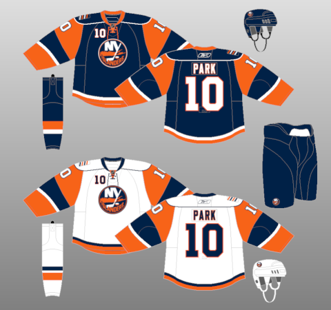
The next thing that I'd like to do is bring all of the individual elements back together and look at the entire uniform as a whole. For the last time, for comparison sake, we need to look at the present and future (home, away) of the Tampa Bay Lightning. The first thing that really stands out here are the different crests on the front of the home and away jerseys. Some teams can pull this off, but I don't think the Lightning succeeded in this regard. I liked it when the Thrashers did it early in their history. It looked good when the Flames did it in the early 2000s. The Minnesota Wild are currently doing it, and it looks nice, but I still like this combination better. I really don't know why the Lightning think they need to add the region name to the front of their road jerseys, while still using the same crest. It just seems unnecessary to me and doesn't look great in this situation.
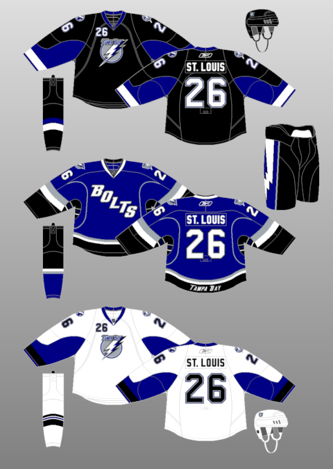
The other thing I really liked about the current Lightning uniforms are the lightning bolts down the side of the pants. I typically like things traditional when it comes to NHL jerseys, but I thought the bolts on the pants really worked for the Lightning in this case. On the new set of uniforms, the bolts are gone. Even in the new blue/white color scheme, I think the bolts on the pants would've worked.
The one part of the current uniform set that is apparently being retained are the "Bolts" alternates (even though I'm sure they'll update the shoulder logos to reflect the new look - no official word on that though). I've never really been a fan of these, or any team jersey that features a slang nickname across the front. On a positive note, the Ottawa Senators will apparently no longer be using their "Sens" alternates next season. Uniform as a whole - Downgrade
The last aspect that needs to be looked at are the team colors. Their current colors are black, blue, silver and white which they are simplifying, making it just a blue and white color scheme. Even though I like the current color scheme better, the new one works with what they are trying to accomplish with this new design. Color scheme - Slight upgrade
With the new color scheme and identity the Lightning are going with next season, it is obvious that they are going for a classic look. This is extremely refreshing, considering the current flashy/gaudy trend that the NHL (and NFL) and Reebok are currently in. Even though I love the though, I think the "Bolts" missed the mark a little bit here.
Subscribe to:
Comments (Atom)